Special elements
Highlight-Banner
The highlight banner can be used for particularly important content. It spans the entire width of the content and offers the option of displaying a light or dark text field and a logo graphic. Here are two examples:
Note: The element can alternatively be displayed with a gray background.
Dark highlight banner without logo
This is the text of the banner. The banner has a dark color scheme.

![[Translate to English:] Alt-Text Uni-Logo](/fileadmin/_processed_/a/9/csm_Uni_Logo_2016-2_4907ccc70b.png)

Accordion
The accordion element allows you to place content “hidden” and thus structure it. It only displays a heading—users can open it and view the information that interests them. Images and text can be displayed within the accordion. There is also a link that can be used to open or close all accordion elements.
Notes: The accordion offers two different behaviors: Either each accordion element is opened individually and remains open, or the open accordion element closes as soon as another accordion element is opened. Alternatively, the element can be displayed with a gray background.
Lorem ipsum dolor sit amet, consetetur sadipscing elitr, sed diam nonumy eirmod tempor invidunt ut labore et dolore magna aliquyam erat, sed diam voluptua. At vero eos et accusam et justo duo dolores et ea rebum. Stet clita kasd gubergren, no sea takimata sanctus est Lorem ipsum dolor sit amet. Lorem ipsum dolor sit amet, consetetur sadipscing elitr, sed diam nonumy eirmod tempor invidunt ut labore et dolore magna aliquyam erat, sed diam voluptua. At vero eos et accusam et justo duo dolores et ea rebum. Stet clita kasd gubergren, no sea takimata sanctus est Lorem ipsum dolor sit amet.
[Translate to English:] Beschreibung
Lorem ipsum dolor sit amet, consetetur sadipscing elitr, sed diam nonumy eirmod tempor invidunt ut labore et dolore magna aliquyam erat, sed diam voluptua.
Lorem ipsum dolor sit amet, consetetur sadipscing elitr, sed diam nonumy eirmod tempor invidunt ut labore et dolore magna aliquyam erat, sed diam voluptua. At vero eos et accusam et justo duo dolores et ea rebum. Stet clita kasd gubergren, no sea takimata sanctus est Lorem ipsum dolor sit amet. Lorem ipsum dolor sit amet, consetetur sadipscing elitr, sed diam nonumy eirmod tempor invidunt ut labore et dolore magna aliquyam erat, sed diam voluptua. At vero eos et accusam et justo duo dolores et ea rebum. Stet clita kasd gubergren, no sea takimata sanctus est Lorem ipsum dolor sit amet.
Lorem ipsum dolor sit amet, consetetur sadipscing elitr, sed diam nonumy eirmod tempor invidunt ut labore et dolore magna aliquyam erat, sed diam voluptua. At vero eos et accusam et justo duo dolores et ea rebum. Stet clita kasd gubergren, no sea takimata sanctus est Lorem ipsum dolor sit amet. Lorem ipsum dolor sit amet, consetetur sadipscing elitr, sed diam nonumy eirmod tempor invidunt ut labore et dolore magna aliquyam erat, sed diam voluptua. At vero eos et accusam et justo duo dolores et ea rebum. Stet clita kasd gubergren, no sea takimata sanctus est Lorem ipsum dolor sit amet.

Beschreibung
Lorem ipsum dolor sit amet, consetetur sadipscing elitr, sed diam nonumy eirmod tempor invidunt ut labore et dolore magna aliquyam erat, sed diam voluptua. At vero eos et accusam et justo duo dolores et ea rebum. Stet clita kasd gubergren, no sea takimata sanctus est Lorem ipsum dolor sit amet. Lorem ipsum dolor sit amet, consetetur sadipscing elitr, sed diam nonumy eirmod tempor invidunt ut labore et dolore magna aliquyam erat, sed diam voluptua. At vero eos et accusam et justo duo dolores et ea rebum. Stet clita kasd gubergren, no sea takimata sanctus est Lorem ipsum dolor sit amet.
Beschreibung
Description
Lorem ipsum dolor sit amet, consetetur sadipscing elitr, sed diam nonumy eirmod tempor invidunt ut labore et dolore magna aliquyam erat, sed diam voluptua.
Contact Box
Contact boxes are a good way to display various information about employees and their availability at a glance. Unlike the UniWien Personnel List plug-in, which can read data directly from u:find, the information here must be entered manually. However, the display is more flexible.
Several contact boxes can be created at once in a single element, which are then displayed in up to three columns on the desktop. On mobile devices, the contact boxes are arranged one below the other.
There are several layout options:
- Without image
- Standard layout (large image)
- Round image
Notes: In addition to the name, email address, and phone number, information such as links to a website or specific social media channels can also be entered. The latter are displayed in the contact box with their corresponding icons.
Alternatively, the element can be displayed with a gray background.
Contact box without image
First name Last name
Lorem ipsum dolor sit amet, consetetur sadipscing elitr, sed diam nonumy eirmod
EmailCopy email to clipboard
Linktext zu einer Website
First name Last name
Lorem ipsum dolor sit amet, consetetur sadipscing elitr, sed diam nonumy eirmod
EmailCopy email to clipboardLinktext
First name Last name
Lorem ipsum dolor sit amet, consetetur sadipscing elitr, sed diam nonumy eirmod
EmailCopy email to clipboardContact box with standard layout (large image)

First name Last name
Lorem ipsum dolor sit amet, consetetur sadipscing elitr, sed diam nonumy eirmod
EmailCopy email to clipboard
Linktext zu einer Website

First name Last name
Lorem ipsum dolor sit amet, consetetur sadipscing elitr, sed diam nonumy eirmod
EmailCopy email to clipboard+43-1-4277-444
Linktext zu einer Website
Contact box with round image

First name Last name
Lorem ipsum dolor sit amet, consetetur sadipscing elitr, sed diam nonumy eirmod
EmailCopy email to clipboard
Linktext zu einer Website

First name Last name
Lorem ipsum dolor sit amet, consetetur sadipscing elitr, sed diam nonumy eirmod
EmailCopy email to clipboardLinktext
Media Echo
The media echo is an element for linking media reports. It offers space for up to four entries, which are displayed side by side on the desktop and as a slider on mobile devices. It is possible to link to further reports or a media archive via a link below. For each entry, you can set a suitable icon (predefined selection in the backend), a title, a preheadline, an author name, and a date.
Note: The element can alternatively be displayed with a gray background.
Social Media & Podcast
This element is used to present multiple social media channels, a podcast, and a blog together on the website. It includes an explanatory text and an optional photo. The individual channels are displayed using predefined icons below the text.
Notes: In the mobile version, the image is automatically hidden.
The element can alternatively be displayed with a gray background.

Shortfacts
This element presents brief information in a very clear manner. It is particularly suitable for presenting courses and training opportunities in a compact form with various specific details (e.g., qualification, duration, costs, etc.) on a website. A link button allows direct contact, and additional contact details make it easier to clarify any open questions. The reduced display ensures clarity and facilitates navigation. Two entries can also be displayed side by side. These can be swiped on mobile devices.
Note: The element can alternatively be displayed with a gray background.
Quotations
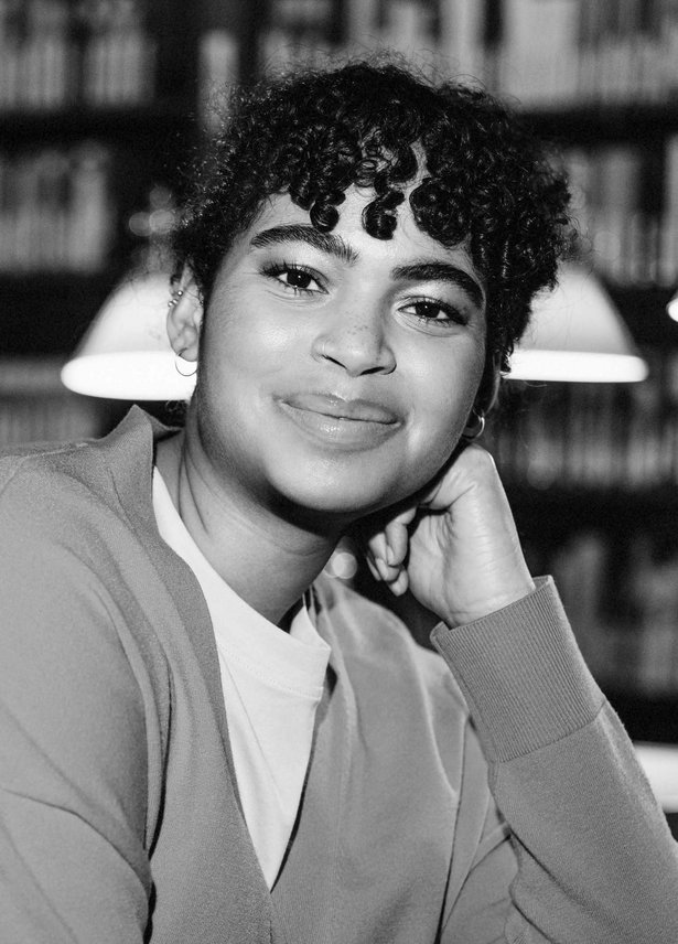
This element can be used to display one or more quotes on a website. Each quote includes a large image, a tagline, the quote itself, the name and affiliation of the person quoted, and a link to further information.
Notes: If several quotes are entered in the element, they are automatically displayed as a slider. On mobile devices, the quote appears below the image.
The element can alternatively be displayed with a gray background.
Quotes involving one person
-
 CopyrightTagline
A lie is like a snowball: the longer you roll it, the bigger it gets.
Martin Luther, Monk and professor of theologyLink text

Quotes involving multiple people
-
 CopyrightTagline
A lie is like a snowball: the longer you roll it, the bigger it gets.
Martin Luther, Monk and professor of theologyLink text -
![[Translate to English:] Alt-Text](/fileadmin/_processed_/f/0/csm_20250228_HG_Audimax_C_Ian_Ehm_20_0faa191f9d.jpg) CopyrightTagline
CopyrightTaglineWhat doesn't kill me makes me stronger.
Friedrich Nietzsche, Philologist and philosopherLink text -
 CopyrightTagline
What we know is a drop, what we don't know is an ocean.
Isaac Newton, Universal scholarLink text

![[Translate to English:] Alt-Text](/fileadmin/_processed_/f/0/csm_20250228_HG_Audimax_C_Ian_Ehm_20_9bd8c9474f.webp)

Call to Action
This element is used to place a clear call to action within a website. It consists of a preheadline, a headline, and one or two link buttons—the version with one button is recommended.
It is available in two layout versions:
Notes: In the university blue version, the button is white. Alternatively, the element can be displayed with a gray background.
Facts & Figures
This element can be used to present key figures in various formats on a website. In the standard layout, the element is displayed without a large background image – either in white with a colored line or in full university blue (similar to the teasers). Alternatively, a banner version can be selected, which includes a full-screen background image with a headline, a subheadline, and a link button.
Notes: The key figures in the element cannot be linked. The variants with line and full-screen in university blue should not be combined. Alternatively, the element can be displayed with a gray background.
