Typical page content
Text & Media
This element is one of the most important and frequently used content elements. It offers various options for presenting images, videos and text in an appealing way on the page. In principle, there are four different layout variants for desktop display that allow images/videos to be used in combination with text.
On mobile devices, text and media are displayed one below the other.
- Image/video (top centre) with button
- Image/video (bottom centre) without button
- Image/video on the right side of the text with button
- Image/video on the left side of the text without button
Note: Click-to-enlarge can be set as an option for media.
Instructions for Text & Media element (coming soon)
Image/video (top centre) with button
Lorem ipsum dolor sit amet, consetetur sadipscing elitr, sed diam nonumy eirmod tempor invidunt ut labore et dolore magna aliquyam erat, sed diam voluptua. At vero eos et accusam et justo duo dolores et ea rebum. Stet clita kasd gubergren, no sea takimata sanctus est Lorem ipsum dolor sit amet. Lorem ipsum dolor sit amet, consetetur sadipscing elitr, sed diam nonumy eirmod tempor invidunt ut labore et dolore magna aliquyam erat, sed diam voluptua. At vero eos et accusam et justo duo dolores et ea rebum. Stet clita kasd gubergren, no sea takimata sanctus est Lorem ipsum dolor sit amet.
Description
Image/video (bottom centre) without button
Lorem ipsum dolor sit amet, consetetur sadipscing elitr, sed diam nonumy eirmod tempor invidunt ut labore et dolore magna aliquyam erat, sed diam voluptua. At vero eos et accusam et justo duo dolores et ea rebum. Stet clita kasd gubergren, no sea takimata sanctus est Lorem ipsum dolor sit amet. Lorem ipsum dolor sit amet, consetetur sadipscing elitr, sed diam nonumy eirmod tempor invidunt ut labore et dolore magna aliquyam erat, sed diam voluptua. At vero eos et accusam et justo duo dolores et ea rebum. Stet clita kasd gubergren, no sea takimata sanctus est Lorem ipsum dolor sit amet.
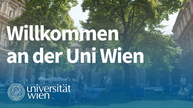
Image/Video on the right side of the text with button
Lorem ipsum dolor sit amet, consetetur sadipscing elitr, sed diam nonumy eirmod tempor invidunt ut labore et dolore magna aliquyam erat, sed diam voluptua. At vero eos et accusam et justo duo dolores et ea rebum. Stet clita kasd gubergren, no sea takimata sanctus est Lorem ipsum dolor sit amet. Lorem ipsum dolor sit amet, consetetur sadipscing elitr, sed diam nonumy eirmod tempor invidunt ut labore.
Description
Image/Video on the left side of the text without button
Lorem ipsum dolor sit amet, consetetur sadipscing elitr, sed diam nonumy eirmod tempor invidunt ut labore et dolore magna aliquyam erat, sed diam voluptua. At vero eos et accusam et justo duo dolores et ea rebum. Stet clita kasd gubergren, no sea takimata sanctus est Lorem ipsum dolor sit amet. Lorem ipsum dolor sit amet, consetetur sadipscing elitr.
Gallery & Slider
In addition to the Text & Media element, there is also a separate element in two different layout variants for the media-friendly presentation of images:
Notes: The slider version is designed to span the entire page width and therefore only makes sense in the desktop view if there are at least 3 images. For both elements, the individual images can be clicked on and displayed in a lightbox. The caption is also visible in the lightbox. The lightbox is displayed in the centre of the page on a background area. The element can alternatively be displayed with a grey background.
Instructions for the Gallery & Slider element (coming soon)
Info box
Info boxes serve to highlight important information and present it in a concise manner. Lists, text elements and links can be displayed within the info boxes. There are three layout variants:
- Grey background, without frame
- Grey background, with frame in university blue
- Background in university blue
Notes: In the version with a university blue background, the font and icon are white.
Alternatively, the element can be displayed with a grey background.
Instructions for the Infobox element (coming soon)
Info box background in university blue
Lorem ipsum dolor sit amet, consetetur sadipscing elitr, sed diam nonumy eirmod tempor invidunt ut labore et dolore magna aliquyam erat, sed diam voluptua.
Downloads
A simple element for integrating downloadable content, available in two different layout variants:
Notes: If the number of downloads with images exceeds the content width, a slider is used. Downloads without images are arranged one below the other. In order to give users a clear, concise appearance, the links are not underlined in this case. Information such as file size and name can be displayed optionally.
Alternatively, the element can be displayed with a grey background.
Instructions for the Downloads element (coming soon)
Downloads description, preview image and file size
-
Intellectual capital statement 2023 (pdf / 785 KB)
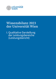
-
Intellectual capital statement 2023 (pdf / 785 KB)
-
Intellectual capital statement 2023 (pdf / 785 KB)
-
Intellectual capital statement 2023 (pdf / 785 KB)
-
Intellectual capital statement 2023 (pdf / 785 KB)
-
Intellectual capital statement 2023 (pdf / 785 KB)
-
Intellectual capital statement 2023 (pdf / 785 KB)
Table
This element is used for the structured presentation of data in multiple columns and rows. It is particularly suitable for compact overviews (e.g., time specifications, key figures, or comparisons). Tables can be displayed with or without a table header. The number of columns and rows can be defined individually. The table header is located at the top by default and offers sorting options. In the mobile view, the table can be scrolled horizontally.
There are three layout variants:
Notes: For sortable tables, the header must be placed at the top. Alternatively, the element can be displayed with a gray background.
Teaser
Teasers are an important element for structuring and presenting content and also serve as a navigation element that guides users through the site. They offer versatile display options – in white, full-screen in university blue, with or without colour bars, with or without icons, with or without images, with or without link buttons – and can be used in a desktop layout of one to four columns and thus in various sizes. On mobile devices, teasers are displayed one below the other.
Here are a few examples:
- Teaser white, 1 column, with image & button
- Teaser white with bar, 2 columns, with image & button
- Teaser white & full-width in university blue, 3 columns, without image & button
- Teaser white, with & without bar, 4 columns, with image, without button
- Teaser white with & without bar, 4 columns, without image, without button, headline only
- Teaser white & full-width in university blue, with icon, with & without bar, 4 columns, without image & button
- Teaser white, with links, 4 columns, with & without bar, without image
Notes: The bars and icons can be selected from the colours of the corporate design. Combining teasers with colour bars, without colour bars and with icons within one element is not recommended. Teasers can be used with or without teaser text. If text is entered in the ‘Link text’ field in the backend, it is automatically displayed as a button.
Instructions for the teaser element (coming soon)
Template teaser page with different variants
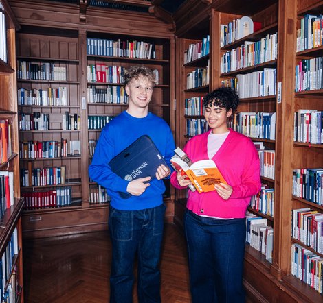
Teaser white with bar, 2 columns, with image & button
-
Teaser-headline
Lorem ipsum dolor sit amet, consetetur sadipscing elitr, sed diam nonumy eirmod tempor invidunt ut labore et dolore magna aliquyam erat, sed diam voluptua.
![[Translate to English:] Alt-Text](/fileadmin/_processed_/8/c/csm_20250228_HG_Audimax_C_Ian_Ehm_2_0fc3490ea1.jpg) Copyright
Copyright -
Teaser-headline
Lorem ipsum dolor sit amet, consetetur sadipscing elitr, sed diam nonumy eirmod tempor invidunt ut labore et dolore magna aliquyam erat, sed diam voluptua.
 Copyright
Teaser white & full surface in university blue, 3 columns, without image & button
-
Teaser-headline
Lorem ipsum dolor sit amet, consetetur sadipscing elitr, sed diam nonumy eirmod tempor invidunt ut labore et dolore magna aliquyam erat, sed diam voluptua.
-
Teaser-headline
Lorem ipsum dolor sit amet, consetetur sadipscing elitr, sed diam nonumy eirmod tempor invidunt ut labore et dolore magna aliquyam erat, sed diam voluptua.
-
Teaser-headline
Lorem ipsum dolor sit amet, consetetur sadipscing elitr, sed diam nonumy eirmod tempor invidunt ut labore et dolore magna aliquyam erat, sed diam voluptua.
Teaser white, with & without bar, 4 columns, with image, without button
-
Teaser-headline
Lorem ipsum dolor sit amet, consetetur sadipscing elitr, sed diam nonumy eirmod tempor invidunt ut labore et dolore magna aliquyam erat, sed diam voluptua.
![[Translate to English:] Alt-Text](/fileadmin/_processed_/8/c/csm_20250228_HG_Audimax_C_Ian_Ehm_2_6cf817d56d.jpg) Copyright
Copyright -
Teaser-headline
Lorem ipsum dolor sit amet, consetetur sadipscing elitr, sed diam nonumy eirmod tempor invidunt ut labore et dolore magna aliquyam erat, sed diam voluptua.
 Copyright
 -
Teaser-headline
Lorem ipsum dolor sit amet, consetetur sadipscing elitr, sed diam nonumy eirmod tempor invidunt ut labore et dolore magna aliquyam erat, sed diam voluptua.
 Copyright
 -
Teaser-headline
Lorem ipsum dolor sit amet, consetetur sadipscing elitr, sed diam nonumy eirmod tempor invidunt ut labore et dolore magna aliquyam erat, sed diam voluptua.
 Copyright
Teaser white & full-surface in university blue, with icon, with & without bar, 4 columns, without image & button
-
Teaser-headline
Lorem ipsum dolor sit amet, consetetur sadipscing elitr, sed diam nonumy eirmod tempor invidunt ut labore et dolore magna aliquyam erat, sed diam voluptua.
-
Teaser-headline
Lorem ipsum dolor sit amet, consetetur sadipscing elitr, sed diam nonumy eirmod tempor invidunt ut labore et dolore magna aliquyam erat, sed diam voluptua.
-
Teaser-headline
Lorem ipsum dolor sit amet, consetetur sadipscing elitr, sed diam nonumy eirmod tempor invidunt ut labore et dolore magna aliquyam erat, sed diam voluptua.
-
Teaser-headline
Lorem ipsum dolor sit amet, consetetur sadipscing elitr, sed diam nonumy eirmod tempor invidunt ut labore et dolore magna aliquyam erat, sed diam voluptua.